
Color Blending & Gradients in Embroidery: The Cheat Sheet
Thread doesn’t fade like ink. Learn the “Optical Blending” tricks to create smooth gradients.
In digital design, creating a gradient is easy. You simply click a button in Illustrator, and Red fades perfectly into Yellow. In embroidery, creating that same effect is one of the hardest technical challenges you will face.
Why is it so hard? Because thread is a solid object. It has a fixed color and opacity. Unlike ink, you cannot lower the “transparency” of a polyester thread to make it fade out. You are working with physical pixels that have thickness and weight.
However, high-end embroiderers achieve realistic sunsets, metallic sheens, and 3D shading every day. How? They “cheat” the eye using a technique called Optical Blending.
The Problem: Thread vs. Ink
When a customer sends you a vector file with a complex gradient, your first instinct might be to tell them “it can’t be done” or to simplify the logo into blocky stripes. But if you want to land big corporate clients, you need to offer a better solution.
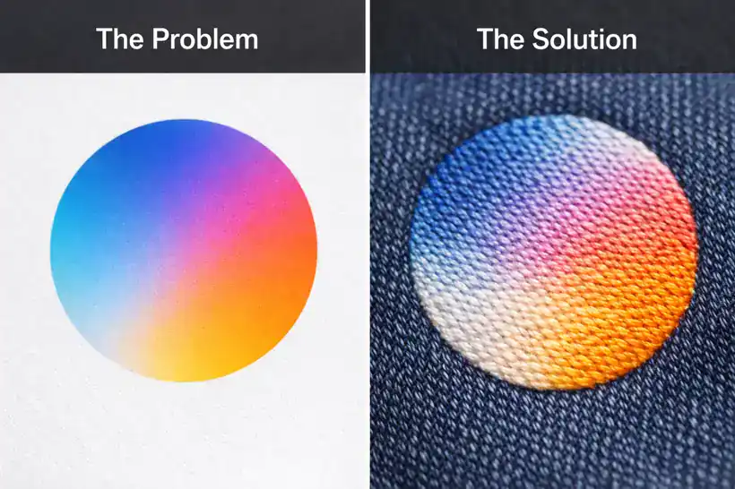 Left: Digital Gradient (Smooth). Right: Embroidered Blend (Textured).
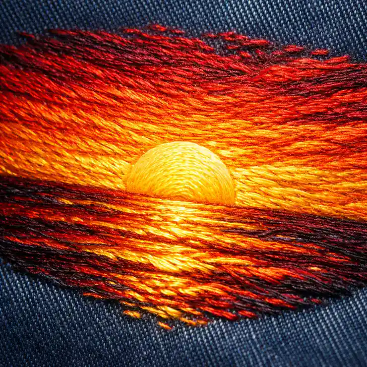
We cannot mix inks, but we can mix spacing. By varying the density of two different thread colors and layering them on top of each other, we create the illusion of a third color. This is the same principle used in pointillism painting.
Technique 1: Accordion Spacing (The Math)
The most common method for blending two colors is “Accordion Spacing” (also known as Gradient Fill). This involves overlapping two layers of stitching with opposing density values.
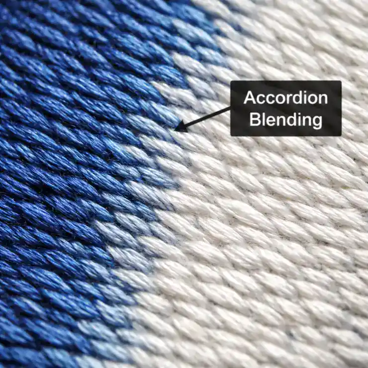 As one color fades out, the other fades in, interlocking like a zipper.
Imagine you want to blend Blue into White:
- Layer 1 (Blue): Starts at 100% density (0.40mm spacing) on the left. As it moves right, the stitches get farther apart, ending at 0% density (2.0mm+ spacing).
- Layer 2 (White): Starts at 0% density on the left. As it moves right, the stitches get closer together, ending at 100% density.
When these two layers are stitched on top of each other, the white threads fill the physical gaps left by the blue threads. From a distance of three feet, your eye mixes them together to create a smooth “Light Blue” middle section.
Critical Rule: Match the Stitch Angles
For Accordion Blending to work, both layers of thread must run at the same angle. If your Blue thread runs at 45 degrees and your White thread runs at 90 degrees, they will pile up on top of each other instead of interlocking. This creates a thick, messy patch that looks like a mistake.
Technique 2: Dithering (The “Jitter” Effect)
Accordion spacing creates a very smooth, mechanical look. But for organic shapes like animal fur, clouds, or sunsets, you want something less rigid. This is where Dithering comes in.
Dithering randomizes the end points of the stitches. Instead of a straight line where the colors meet, the stitches “finger” into each other in jagged, random lengths. This prevents the “stripe effect” (banding) where you can clearly see where one color stops and the next begins.
This requires advanced control in Manual Digitizing software, but it yields the most artistic results.
Technique 3: The Secret Weapon (60wt Thread)
Standard embroidery thread is 40wt (weight). It is thick and provides good coverage. However, when you layer two colors of 40wt thread, the embroidery can become very thick and “bulletproof.”
For complex gradients, professional digitizers often switch to 60wt Thread. This thread is 25% thinner. It allows you to layer colors more aggressively without building up a “hard patch” on the shirt. Using thinner thread creates a much higher-definition blend, similar to increasing the DPI on a printer.
The “1-Inch Rule” (Physical Limitations)
There are physical limits to what a needle can do. To create a believable gradient, you need space.
We follow the 1-Inch Rule: If the area you are trying to blend is smaller than 1 inch wide, do not attempt a gradient. There simply isn’t enough physical room for the density to ramp down and ramp up smoothly. If you try to blend in a small 0.5-inch space, it will just look like a dirty smudge.
In these cases, simplify the logo. Pick a solid middle color (e.g., instead of Red fading to Yellow, just use Orange) or use Small Text techniques to keep it clean.
Technique 4: Thread Selection Strategy
You cannot blend contrasting colors smoothly. Trying to blend Black directly into White will always look gray and messy. You will see the “salt and pepper” effect.
For a successful gradient, you need Bridge Colors. If you need to go from Red to Yellow, do not blend them directly. Use an Orange thread in the middle. The transition from Red -> Orange -> Yellow mimics how light works in the real world and results in a much smoother gradient.
If the artwork is a low-quality JPEG, we cannot see where the gradient starts and stops. We always recommend converting the file to vector first to define the layers. Check out our Vector Art Services to prep your files.
Got a Complex Gradient Logo?
Don’t simplify your art. Let our expert digitizers hand-blend the threads for a premium look.
Get a Gradient Quote ($14.88 Flat)Turnaround in 4-6 hours.
Serving California’s Apparel Decorators
We provide specialized digitizing support for print shops in our key hubs: